
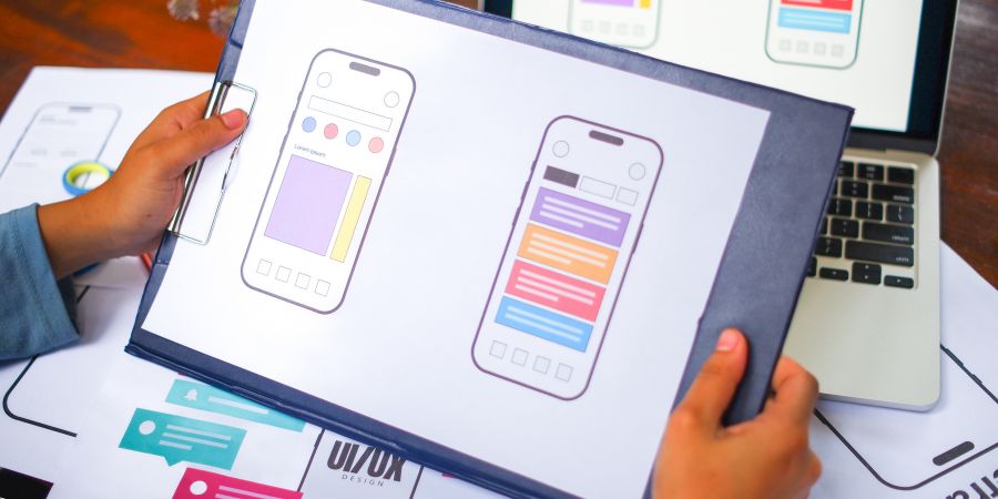
Competitor analysis has always been part of a product team’s job, but the way it gets done matters enormously. There’s a significant difference between a team that skims competitor screenshots and a team that methodically traces the full user journey through a rival product – from first touch to conversion. Most teams, unfortunately, default to the former. Not because they don’t care, but because doing it properly takes time and structure that most workflows simply don’t support.
The conventional approach goes something like this: someone installs a competitor’s app, pokes around for twenty minutes, takes a handful of screenshots, and pastes them into a shared document. Maybe a designer annotates a few screens. Maybe someone writes up a summary. But by the time that research reaches the broader team, critical context has already been lost, the order of steps, the micro-copy on an error screen, the exact moment a paywall surfaces. What’s left is a collection of impressions rather than structured intelligence.
The Problem Isn’t Effort, It’s Structure
Product teams aren’t failing at competitor research because they’re lazy or underprepared. The real issue is that the process is inherently fragmentary. Apps are designed as interconnected systems, but the tools most teams use to study them – screenshots, note-taking apps, shared folders – treat everything as a flat pile of images with no inherent order. There’s no native concept of a flow, a sequence, or an end-to-end journey.
Product teams can address this directly through curated resources like pageflows.com/all-products, which organizes real user flows from leading digital products into searchable, structured libraries, built around complete interaction sequences rather than disconnected screenshots. Onboarding flows, subscription upgrade paths, checkout experiences, login and account recovery sequences, they’re all captured in context, making it genuinely possible to trace how a competitor engineers an experience from entry point to completion.
Reading Flows, Not Screens
There’s a principle that seasoned UX researchers return to consistently: a single screen tells you almost nothing in isolation. It’s the sequence that carries meaning. A signup screen that looks clean and minimal might be hiding three redirects and a confusing verification loop just beyond it. A checkout flow that appears friction-heavy at step one might be doing something strategically sound at step two that significantly improves completion rates. Without the full sequence, you’re essentially analyzing the cover of a book and concluding the story inside.
Why Isolated UI Comparisons Lead Teams in the Wrong Direction
When product teams benchmark competitors based on individual screens, they tend to conclude aesthetics: color choices, button placement, typography decisions, rather than structural and strategic ones. That type of analysis produces cosmetic recommendations, not meaningful differentiation. It generates discussions about whether a primary CTA should be a different shade or sit higher on the page, when the more consequential question is whether that CTA appears before or after the user has encountered any real product value.
Real flow analysis pushes the conversation into a different territory entirely. When you can examine a competitor’s complete onboarding sequence, every screen, every prompt, every skip option, every error state, you start forming questions about intent.
- Why did they place the notification permission request at this specific moment rather than earlier?
- What logic sits behind showing pricing before a user has even finished their profile setup?
These aren’t aesthetic questions. They’re strategic ones, and answering them leads to product decisions with actual weight rather than incremental visual tweaks.
What Structured Libraries Do That Ad Hoc Research Can’t
Speed and consistency are two qualities that product teams rarely associate with competitor UX analysis, yet they’re exactly what this kind of work demands to be genuinely useful. One of the most underappreciated advantages of working from a structured flow library is the elimination of inconsistency that’s baked into manual research. When three team members each independently explore a competitor’s app, they return with three different sets of observations, shaped by whichever paths they happened to navigate, whatever states they encountered, and whatever they personally judged worth capturing. The resulting picture is incomplete by design.
A centralized library standardizes the input. Everyone is working from the same flows, the same screen sequences, the same captured states. That shared foundation makes cross-functional discussions more efficient because nobody spends the first half of a meeting reconciling conflicting recollections. It also makes structured, product-by-product comparisons genuinely tractable, examining how two competing SaaS platforms each handle free-to-paid conversion, or how different consumer apps architect their account deletion flow, becomes a matter of direct observation rather than inference.
Turning Observations Into Decisions That Matter
The real payoff from structured competitive analysis isn’t a polished audit document or a tidy comparison matrix. It’s the shift in how product discussions happen. When a team can reference a specific flow and say, “This competitor holds pricing back until after the user completes two meaningful setup steps – here’s exactly how they execute it,” the conversation becomes grounded in evidence. The debate stops centering on what you believe competitors are doing and moves toward what they’re demonstrably doing.
That transition, from assumption to documented observation, is the difference between surface-level benchmarking and genuine UX intelligence. It’s also what makes flow libraries worth treating as a recurring research input rather than a one-time tool pulled out only when a major redesign is already underway. The teams that use this kind of structured access consistently are the ones building product intuition that’s actually backed by something real.