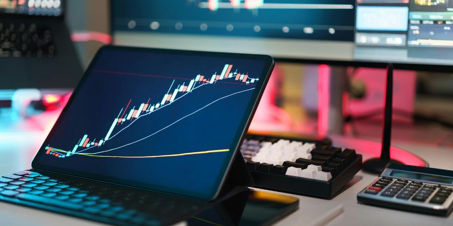
As crypto continues to mature and grow in the modern digital age, the fast-paced and constantly volatile markets that crypto creates operate the full day long. Affected by wider global changes and rapid price fluctuations, many traders have to continually keep an eye on the trends and forms of different coins every single day. It doesn’t matter if you are a long-term investor, day trader or swing trader; operating on the crypto market requires those involved to use crypto charts in order to gain better profits. Understanding and monitoring these charts gives you the best chance at utilizing your specific strategies as effectively as possible. These charts are the best way to visualize data and provide investors with a better idea of trends and market movements. But which crypto charts should you use?
Line Charts
The most basic and easy to understand charts in the wider financial markets, including crypto, are line charts. They track a basic line over the axis that connects the closing price at the end of each day over a set period. This gives people the vital overall picture of the wider trends and patterns occurring in the market. Their basic nature makes them easier to understand than other graphs, and because of this, they cater to longer-term investors or beginners in crypto. Cryptonews implements the use of bar graphs in their analysis of the best cryptocurrencies to invest in in 2025, for example, which allows people to understand the general trends of each coin over time more easily.
Bar Charts
These are the simple yet effective graphs that you will know from your childhood. These sorts of graphs can be used for a whole host of different data, which is why so many people know of bar graphs. When it comes to cryptocurrencies, the bar graph is a simplistic alternative compared with other data and graphs in an often confusing industry. Keeping it simple does not mean that the bar graph loses its legitimacy or efficacy. Bar charts will typically show OHLC prices (open, high, low, close) in a standardised block form. Each bar represents a period of time, with the horizontal lines marking the open and close of trading. They can be less visually confusing than other charts, offer an accurate display of OHLC data, but do remain fairly basic.
Candlestick Charts
These are the most popular and well-used charts for analysis in crypto. Candlestick charts have two parts to them. The body and the shadows (or wicks). The body is indicative of the difference between the open and close price of the given coin within a given time. The shadow is a marker of the highest and lowest prices during the same time interval. These types of charts can be made into time intervals of minutes to years, depending on what type of investor you are and what data you are after.
Not only do they recognise the OHLC prices of certain coins within certain periods, but they also typically appear as red and green stacks (candles). The red coloured data indicates a bearish (falling share prices), whilst the green indicates a bullish (rising share prices).
Candlestick charts are the most widely used as they offer the easiest way to analyse a lot of data. This allows interested individuals to realise market trends for more accurate prediction of outcomes and wiser investments.
Volume Charts
These types of charts are measured from the close of the day to the close of the next day. When the close is less than the previous, it will be marked as red; if more than, it is marked as positive. They are used more generally to track the number of digital assets traded over a given 24-hour period. This allows investors to identify the strength of prices for certain coins and also allows traders to analyse wider accumulation or distribution patterns in the market.
To Conclude
There is no quick fix answer or one way to operate when it comes to crypto charts. They all offer different data to potential investors in different formats. The best chart for you is typically the one that is going to best suit your overall crypto goals and trading style. Equally, some charts can be more confusing for novices or beginners in digital finance, which may play a role in the type of chart utilized.
Crypto trading is more than just a random gamble. It takes time, effort, analysis, data and timely decisions to benefit with the most profit, which is why using the right chart is the best way to ensure you are as informed as possible. Why not give yourself the best opportunity to gain the maximum amount of profits?


